
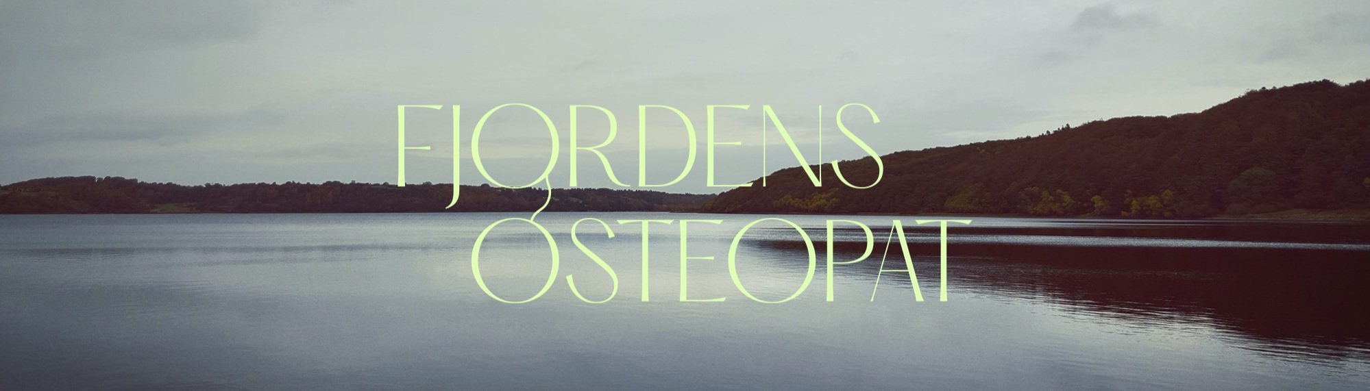
Fjordens Osteopat
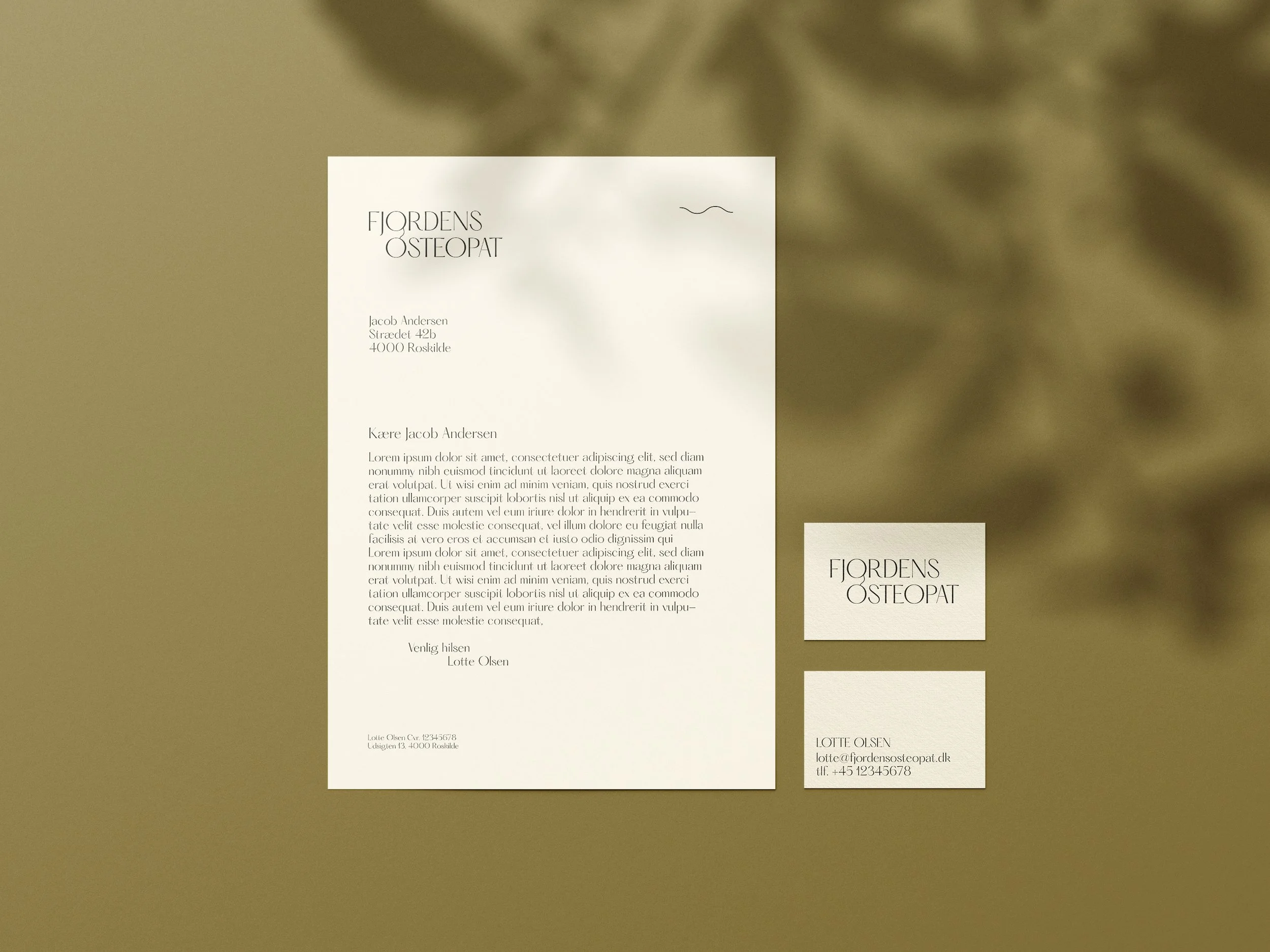
Lotte, the owner of Fjordens Osteopat, needed both a logo and a visual identity that backed up her personal mission of being an osteopath. At the same time, she moved to a new location near Roskilde Fjord, and this was a perfect visual and recognizable element for Lotte's clients.
Balance and movement
The visual identity shows what kind of osteopath Lotte’s aiming to be: calm and thorough. Lotte focuses on the treatment of the whole person, and with her visual identity she wanted to radiate balance, movement and at the same time professionalism. Her clinic is designed as an extension of the visual identity, using the same colors and visual elements.
Project
Solution


Please do not hesitate to contact us for further information on projects.